- Home
- Resources
- Media kit
Brand assets
Our logo, colors and type, for partners, press and anyone writing about us.
The logo
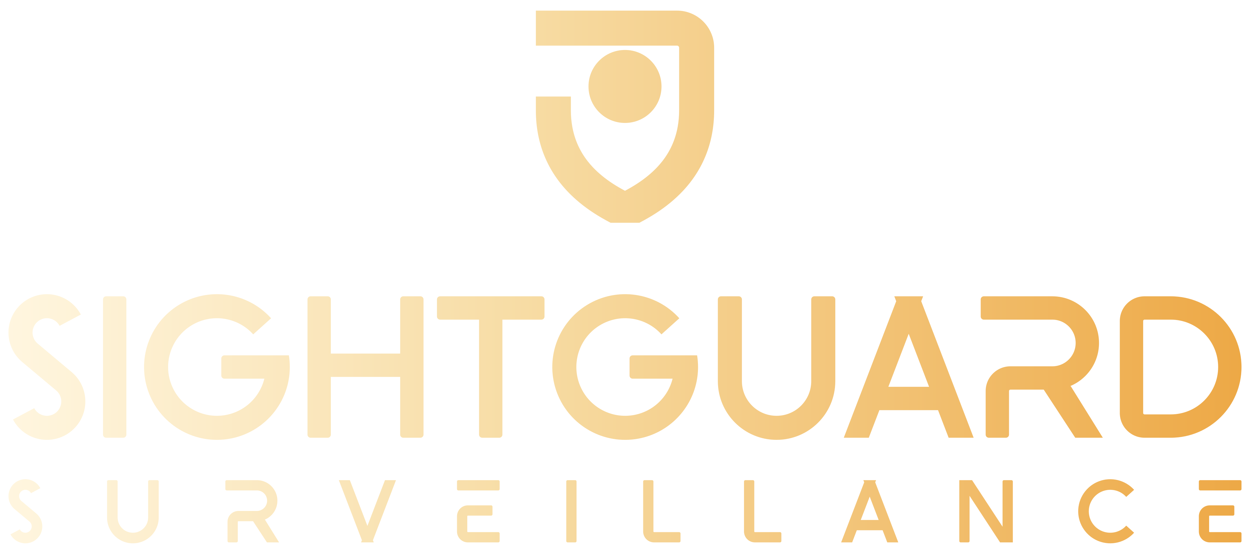
A shield with a lens inside it: we guard your site by watching it. The shield and the letters are drawn with the same strokes, and its open top corner matches the E and R. Use brass on black or teal, and the dark version on cream or white.



Using the logo
- Keep clear space around it equal to the height of the S
- Don’t stretch, outline or recolor it
- Don’t place it on busy photos without a dark overlay
- Smallest size on screen: 120 px wide, or the symbol alone below that
Colors
Black and deep teal for the big surfaces, cream for text, brass for the things people click.
Black#000000
Header, hero, footer
Header, hero, footer
Deep teal#064343
Section bands
Section bands
Cream#FFFAED
Text on dark
Text on dark
Brass#F0B357
Buttons, links, numbers
Buttons, links, numbers
Fog#EAEBED
Light sections
Light sections
Ink#1B1B1B
Text on light
Text on light
Clash Display
Every heading and paragraph on the site is set in Clash Display by Indian Type Foundry: Medium for headings, Regular for text.
Big section titles run in capitals. Everything else is in sentence case. The logo letters are drawn for SightGuard and are not a font.